 |
| Bob’s Trajectory, oil on canvas, 150 x 120cm |
KG: I don’t know at what point I consider
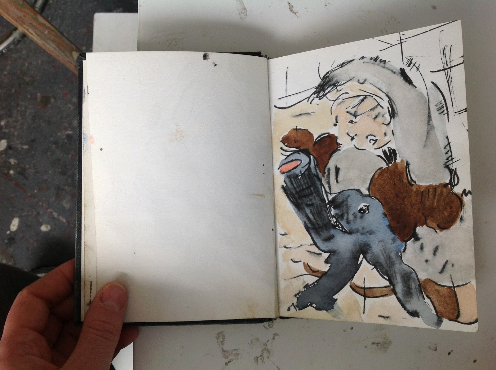
myself to have moved from drawing to painting. I’ll start line drawings in a
sketchbook, then I’ll add watercolour, and then I’ll chop them up and collage them.
I also photocopy some of them and chop the photocopies up, muddle them around.
Then I’ll draw back from the collages, so they all get churned up.
.JPG)
NN: What does the collage aspect help you
with?
KG: It helps me to surprise myself. It
becomes more an exploratory process where I’m searching out images. Drawing an
image from scratch is not that interesting to me. When I start to chop the
figure up it becomes more exciting and interesting. I’ll start off with a
sketch of a naked character in a particular pose from pictures online, books,
magazines or wherever. I remove the clothes and put some ears on, just to make
it my character. When I was at college I found an old book of small, slightly
pornographic cartoons I’d done in my early twenties. They were kind of a joke
but two of the characters represented my boyfriend and me, and I started using
those while I was at the Royal College. I’ve kept the cat ears, the naked
figure, that weird naked cat character from back then, it’s me essentially, and
that just engages me with the work.

NN: They’re always female. Chopping up a
woman can be seen as psychotic. If it was a man doing it
there would be immediate horror wouldn’t there?
KG: Which is why I turn it into my
character and I put these cat ears on. It immediately makes it something other
than human. They’re cartoonized because they’re a line drawing, which again
removes them slightly. When you see a cartoon character cut in half or dropped
from a great height it’s not that distressing is it? I think you can deal with
icky horrible things when you’re doing it through cartoon and through humour
and absurdity. After my operation last year to remove my appendix I got a bit
freaked out about my health so I started going to the gym and you know I enjoy
watching people bending and bulging and stretching their bodies. I’d never been
in hospital before and when I was waiting to go into theatre and lying in bed I
started thinking about really cutting the body open, and I did think about the
fact I cut these bodies up as well. I guess it’s just echoing my interest in
the human body.

NN: Has what you’ve been working on started
to change since then?
KG: I think it’s to early to tell, as I’m
still working on imagery I came up with prior to the operation, but it may be
interesting to see, because autobiographical details that seep in can be
traumatic ones and sometimes points of trauma are the impulse for the work.
NN: Is the cutting, collaging and drawing a
way of building up to a painting?
KG: Yeah, it’s scaffolding towards a big
painting. I tend to have it fairly worked out before I get to the painting
stage, so at the painting stage it’s more copied. My palette is worked out by
then. Because I paint so fluidly and loosely and quickly, if I’ve got the
basics in place that frees me up rather than pins me down, and I can move
through the painting faster.
NN: Is there a preferred time you like to
work on a painting?
KG: I was thinking about that on the way
here. One painting I’ve tried about seven or eight times on different canvases,
but another painting worked first time. So some of them I give up, some of them
I’ll keep trying and keep failing and keep trying again, possibly over a year
or longer, it depends, but then even ones that I’ve given up on I’ll try again.
I feel frustrated if I’ve got a good drawing I think should work as a painting,
so it’s frustration that impels me to try again.
NN: Are they always on fresh canvas if you
try again?
KG: No. I might try five, six, seven
paintings on one canvas. So there’s another image that didn’t work under that
painting.
NN: Is it all covered? Nothing’s showing
through of it.
KG: No, under there you see the green and
the mouth and that cloud up there. You can see the teeth and the feet and the
dark blues coming through. I don’t think you’d know there was a different image
underneath, but had I done that without the image underneath it wouldn’t have
worked. The two have collided to kind of create that.
 |
| Massive Bob, oil on canvas, 150 x 120cm |
NN: They’ve been genetically spliced.
KG: I like that. Which is what happens at
the drawing level, because you get that cutting and rejoining of two parts, and
so it’s also happening at the painting level, which I think needs to happen for
them not to just be copies – I mean they need to be as spontaneous and as exciting
at this scale.
NN: So you get that spontaneous drawing
moment feeling.
KG: But I’ve changed my working method
recently. If they haven’t worked I give up on them more easily and move onto a
different image. Before, I was getting bogged down trying to make one image and
one canvas work, and what I’m trying to come to terms with at the moment is the
things that work do so beyond your control. So as soon as you think ‘Ah that
worked, I’ll just be able to do that again!’ it doesn’t work like that. You’re
always in that really precarious place, having no control. So I’m trying to let
go, which I find quite difficult but that’s the way it is I guess. It feels like
I’m stabbing around in the dark a lot of the time. You just have to accept it’s
a one in ten or one in twenty occurrence. I guess really it’s a war of
attrition, my new method.
NN: What does that mean?
KG: Well, that most of them will fail. Rather
than fiddling with one painting trying to make it work, the more that fail, I
might have twenty goes and one might work. So it’s a numbers thing. I’ve always
had the same problem. In Jujitsu the idea is when you’re fighting if you try
something and it doesn’t work on your opponent there’s no point trying to make that
one thing work. You’ve got to quickly switch and do something else to take them
by surprise, because they’re not just going to stand there while you try and
throw them on the floor in this one movement. You’ve got to change your
tactics. So thinking like that in terms of painting, rather than labouring away
at making one thing work I’m trying to switch more quickly. Every day I’m
coming in and painting a different image.
NN: The scale has gone smaller, more
intimate, hasn’t it?
KG: They’re not intimate paintings I
suppose, because of the scale, but they’re coming from very small, intimate, quick
hand to paper drawings, which I like. David Rayson said they’re big paintings
but they look smaller than they are.
NN: What makes you want to do them large rather
than stick with what is literally an intimate size?
KG: I guess it’s the physicality. I
wouldn’t say I’m a sporty person - I’m going back to autobiography here - but
I’ve always done quite a lot of sports. So I think physicality is quite
important to me and it’s perhaps why I stick with the figure as the base for
the work. At a large scale it allows me to bring that physicality into the
work.
NN: How do you paint them?
KG: They’re painted on the floor so it’s
quite a physical job to lean over and actually make the things.
NN: It makes it like drawing again if
you’re on a horizontal surface.
KG: Yeah, and because I start with
watercolour, in order to recreate in oil what happens with watercolour I make
the paint quite turps-heavy and you can’t do that with it upright because it
just drips. That process of translation from watercolour to oil only really
works for me flat. For ages I was trying to do them upright and then suddenly I
did them on the floor and it was like ‘Yes!’
 NN: You’re actually in those contorted
positions when making them.
NN: You’re actually in those contorted
positions when making them.
KG: Yeah, so there’s this weird echoing of
the imagery in the making.
NN: I can’t help but link it back to the
very beginning when they were the little drawings ...
KG: ... of the cat woman. I find those
little connections pleasurable.
 NN: The figures are almost like a
decorative motif. They stop being a figure and they are a figure. They’re in-between.
NN: The figures are almost like a
decorative motif. They stop being a figure and they are a figure. They’re in-between.
KG: The figure dissolves into design and
motif.
NN: It could be a tail or it could be a
penis, that’s recurring quite a lot. Is that because of the collage process?
KG: Yeah. I tend to work in series. With my
new studio I’ve got a bit more space so I can put them all out. I like the fact
that you can see these motifs occurring, so the mouth there become the piano
keys here. They all relate to each other because these motifs have been cut up
and rearranged. I tend to think of these paintings together in my mind. This
new studio’s quite good for being able to see them as a whole series.
NN: It just makes it so intense. You’re
making a statement having them that way, that they are all interlinked.
KG: I’m spelling it out.
NN: It makes the being in the paintings
more real to me. It becomes a physical thing because I can see the changes. It
hasn’t just occurred in one piece of work and that’s it, it’s a real thing
that’s changed. So it’s like seeing it in different seasons.
KG: I think it’s the same for me, like a
story. I like that idea of bringing these characters to life.

NN: But they’re slippery. You still can’t
really see them exactly or figure out what they are. They haven’t cheery faces
or anything.
KG: No, but the fact that they’re slippery,
perhaps that helps to bring them to life. In real life things are slippery I
think.
NN: And then also there’s the background
which could be representational of tiling and a laboratory space, or could be
again an abstract formal thing of crosses. That recurs a lot in everything from
the drawings onwards.
KG: That cropped up in my first series, The Cutting Mat series, and I kept it because
it’s a useful device and...
NN: ... it’s an echo of the cutting mat as in
collage. I’m sorry. That kind of limits it doesn’t it? If I start saying ‘That
means that and that means that.’
KG: It doesn’t. It’s a continuation, as it
all is. Elements of the figures have come from the drawings from The Cutting Mat, so there is a
continuation with some of the motifs and imagery. I took one or two of those
drawings and I kept collaging and added new elements, like Bobs Trajectory is the same with the arm bending over as one of my
first series ones. And then that arm and those bulbous round things were
carried over, so there’s quite a few things that have been taken forward, but
that’s how I work, things get recycled.
 |
| Half Lord of the Fishes, oil on canvas, 150 x 130cm |
NN: And new things pop in?
KG: Yeah, so this thing, well I don’t often
say this …
NN: … the trumpety thing …
KG: ... it was a saxophone from when I went on a
residency in Italy and I became friends with a saxophonist. I did a sketch of
that, and then brought it in as a new element, but it’s not interesting to me
to see a saxophone. That’s why it gets chopped up - the same as with the human
body, not that interesting - but once you start to chop it all up and mix it
around I stop thinking of it as a saxophone. I think of Bob’s Trajectory as being a mad chef in a kitchen and I think of
that as being a knife, and that’s not a saxophone anymore, it’s a plate or something.
I enjoy bending my imagination with them, but often there’s an autobiographical
moment that’s a trigger for the work and then it moves on from there, but I
think having that moment – that’s what engages me initially with the work and with
the imagery.
NN: How important is it that the viewer
picks up on the personal and autobiographical?
KG: Oh its not and I usually wouldn’t
mention it. That’s a kind of insight.
Hopefully the work is convincing and the
viewer is compelled or won over by it for reasons they can’t put their finger on.
It’s as open for me as for a viewer. There’s no one interpretation that’s
decisive. Everyone has their own take on it, me included, and often the artist’s
opinion about their work is the dullest.
NN: The titles of the work also leave it
open.
KG: Purposefully. Quite often the titles
I’ve picked from books I’m reading. So they’re notes to self really. Kind of
private thoughts I suppose on how I view the work.
NN: Yeah, I think that’s a nice way of
putting it. It returns to the idea of looking in the sketchbook and being
intimate and you come across a little note in a corner like Bob.

KG: Also Bob in Black Adder. They had that character and she was called Kate and
they dressed her up as a boy and called her Bob. That’s a private joke to
myself.
NN: You know, that’s funny, because I was
thinking how your figures start off as women, but by the end they sort of look
more like men.
KG: Sometimes men, sometimes animals. Maybe
its because they’re standing with their legs far apart in unfeminine poses. The
reclining nude, the demure female nude. They’re not that. Because they’re
bending, stretching, they look more active. I think that’s why. Massive Bob reminds me of Elvis Presley
in his later years in his white all-in-one outfit with the collar up ...
NN: ... and the sideburns.
KG: And had he got a bit overweight at that
stage? I was a big Presley fan when I was young. But really Massive Bob and Bob’s Trajectory are connected to pendulums, the bob’s trajectory
is the swing of the pendulum, and a massive bob is the
weight that swings on a stick to make up a pendulum, maybe a clock pendulum, so
in a grandfather clock it's the massive bob swinging to and fro that's making
the thing tick tock. That whole series had time as a
title theme. Sometimes I’ll google something and find titles that way.

NN: What made you google time?
KG: One of the images looked like a juggler
and I googled juggler and one of the juggling moves was called Pendulum and at
that point I looked up pendulum. So it was stumbled upon. Again my titles
happen a bit like my collaging, they’re exploratory ...
NN: ... like a collage of perceptions or
thought.
KG: I like that, and I think that’s how my
brain works.
Kate Groobey is currently exhibiting at Creekside Open 2013 Part 1, selected by
Paul Noble, APT Gallery, Deptford until 26 May 2013, Thurs-Sun, 12 noon-5pm


