
AS: Where do you find your drawings and paintings?
JM: I go to car boot sales or sometimes to antique fairs, there are a few good ones in the south of England. Recently I was in Belgium and went to a couple of great flea markets there. I found a trove of one woman’s whole school career, which included her primary school drawings all the way through to her high school algebra. I think they’re from the 1950s and her name, Monique, is on everything. The drawings are a bit awkward, but in a good way, though her geometric drawings are very precise.
AS: Is that what you look for, an awkwardness?
JM: I’m just looking for potential. It’s hard to explain exactly what that means, but I make that assessment and decide whether it’s any good for my purposes. With this show in mind, I was specifically looking for works on paper to go with a number of drawings I’d already collected over the years. Certain things strike you as having real potential, whether it’s something in a figure’s eyes or a certain juxtaposition within a work, and I particularly like coming across works that are not really finished in the first place. Two of the Belgian schoolgirl’s drawings are of a woman, in one she has no right hand and there’s an ‘x’ marked on her shoulder where the teacher has ticked off that it has been drawn incorrectly. Most of the drawings have comments and grades in red ink over the top of them. In another the woman is in a position of lifting her arms in a way so that after I have immersed the paper in a container of ink, she looks like she’s floating or trying to escape.
AS: Or drowning.
JM: That’s the sort of potential I suppose I am looking for, as though the drawing is asking for an intervention to become complete. At times it feels like a collaboration.
 AS: Do you know what the geometric drawings are?
JM: They’re old-school geometry, along with the pages and pages of equations and calculations to plot them out. I think a French curve and a ruler were used to make them so precise. They’re very technical but still beautiful drawings.
AS: And beautifully presented.
JM: Yes always drawn in with this double line border. I’m sure they’re all done by hand, and she always puts her name, written very neatly. There are some funny ones where she’s got bored and worked out who was dating who on the back of the drawings, some with love hearts. I was glad to see that, you can imagine it must have been pretty rigorous.
AS: The dipping line works well with the geometric look.
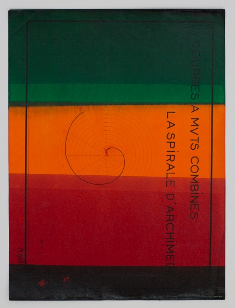 JM: I became most interested in what colour adds to them, particularly when the inks bleed into each other, they remind me of 1960s film strips or at times they become almost Rothko-like. The effect changes them from something dry and analytical to something with more of an emotional content. Just coincidentally the basic half-dozen ink colours are very similar to the colour scheme of a series of cardboard box paintings I made a few years back.
AS: Is it important to use hand-made works, you haven’t used prints or photographs?
JM: It always has been in the past, but I’ve worked with a few engravings for this show. Some are anatomical studies that have been cut out from a medical textbook from the 1800s.
AS: I wanted to ask you about using old things. You might be seen as destroying something but at the same time you have rescued them in the first place.
JM: I’m ambivalent about it, and I hope the work remains ambivalent too. It’s a fine line, I’m obviously the one making the decision about whether they stay as they are or become something else, but I like to think there are other anatomical prints like these out there but these are the only ones dragged into the contemporary world in this way.
 AS: The Chapman brothers make a deliberate point in defacing old Goya prints, but that’s not your concern?
JM: No, but then their work is more about being provocative. In fact I tend towards the other end of the scale, I love coming across a painting that’s not got much going for it, that only costs a fiver but I know will be great for what I want to do. And actually I’m not that interested in appropriation either. What I do is probably closer to a form of recycling - I sometimes think all the painting techniques and brushstrokes have all been made before, all that is left now is how we re-configure them. Which is the idea of the re-mix I suppose, there really isn’t much new under the sun.
AS: Is there something in particular about working with drawings that differs from the paintings?
JM: One main difference is that with the canvases, I only ever work with oil paint. I think in my very first painting class I was taught that you couldn’t put acrylic over oil or it might crack, but you could put oil on top of anything. So I have always thought of oil as the final paint, the ultimate material. But by working on paper I was able to re-look at that and none of these works are done with oil paint. Some are made with acrylic paint and some with ink. Ink is a great medium because it has different properties like the fact that it’s so much thinner than oil or acrylic and also its not totally opaque.
AS: The transparency doesn’t obliterate the image, like in the paintings. Dipping paper seems to emphasize its fragility. Some look so delicate, like a thin leaf of paint.
JM: The ink has dripped off the bottom edge and become more intense in colour and slightly brittle where it has accumulated. Some of the engravings have been dipped two or three times in ink so you end up with this strange thing where two inks overlapping almost create a black, though a ghost of the original image can remain as well.
AS: I bet it’s great to watch the ink soak in.
JM: The old engraving papers are 150 years old and bone dry. They are so absorbent that the colour ends up being deeply saturated so they become darker than works on a thinner paper. I’ve also been working with a vinyl paint called flashe, which is actually a sign-writers paint. It looks like a pure pigment or something, so a sign writer would paint with it and the brushstrokes would disappear.
AS: It’s very flat, but you’ve still got some bubbles in it, where it’s been dipped.
JM: I like when a work reveals its natural physical properties. In fact, all the work is what it is, and it is quite simple to see how it is made.

AS: So what decisions were you making about colour choices for Untitled (Man with necktie), with the black and the vermillion red.
JM: It’s a strange mix of intention and intuition, I was interested because it’s a portrait of a black man, which is rare, and I wanted it to have some gravity so I used the black colour along the top. I was intrigued by his necktie and how it is not flush with his body, and it was just one of those things that is not easily explained. I think the brighter vermillion makes feel more exotic.
AS: It looks like a flag but I wouldn’t know what country.
JM: I don’t know either.
AS: So it’s not political.
JM: No, it’s not. Not for me. I think it has sinister overtones if you want to read that into it.
 AS: Tell me about this one which looks like a blind boy with pointed ears, Untitled (Boy).
JM: If you saw the original image you would see it was just a portrait of a young boy but there was something about it once I started to take a piece of paper and obscure the lower part of it. There was this strange thing in that it wasn’t quite finished in the way the pupils had been drawn and then, for me, that was everything, an amazing point that makes it become something else.
Interview continued in Garageland magazine, Fake issue 12.
Jeff McMillan's drawings are at Consequences, four all saints, London W11, by appointment only, 25 May - 2 July 2011.
He is also exhibiting paintings at Mock Tudor, Transition Gallery Offsite, London W6, 18 June - 10 July 2011.
Thanks so much for this post -- really interesting. I'm so pleased to have found out about Jeff McMillan's work; it's wonderful.
ReplyDeleteGreat interview and a new artist to me. great find. I have a similar thought about oil paint being the final paint. its a lesson that stuck with me to. I think it always made me think that acrylic was for starting of practising in some way.
ReplyDelete