
ET: Drawing is really important. I have no fixed plan of what I’m going to do, so it’s a really open way of working. Something comes about which is a different mode of thinking. It’s like when you’re doing something and you might think of something else completely random and you don’t know why you’re thinking of that, but you are. It’s that kind of space and it gets interesting when I’m trying to articulate that kind of space.
AS: Is text a recent addition to your work?
ET: I think the first time I used text might have been in the Nieves zine. They’re either in bad capitals with a dot over the ‘i’ and things that you’re not supposed to do if you’re being very formal or they’re in a European font, from the 1930s, which was used for advertising or cinema posters; that type of information giving. It’s not my handwriting. It’s like painting words rather than writing.

AS: You’ve used both in ‘The Beautiful North’.
ET: I’ve been going to Sheffield a lot recently, because I’m going out with someone who lives there. A lot of my family is from the North. So we go to Sheffield and then get the train to Manchester, or Liverpool, and do things and it’s like falling in love with the North again after being in the South for such a long time. That painting includes the names of all the men from the North that I have loved, so there’s him and my brother, my dad, my uncle and my husband, who died and was also from the North.
AS: You lived in Jesmond, Newcastle?
ET: Yes. And at the top are images drawn from childhood memories. Every summer I used to go and stay with my grandparents in Wigan and I was remembering things like learning to make toast on the fire and my Grandad buying me my Olivetti typewriter and going round to relatives’ houses.
AS: And sitting very politely on the sofa.
ET: Yes, while a dog eats your biscuit and you’re too scared to tell it to get off. The bit in the middle is about a romantic weekend when I went to Newcastle, Sheffield and then Liverpool in one weekend.
AS: Is that a brooch in the centre?
ET: No, it’s like if you looked at the thing as a whole, it could be a mirror, or some mirrored thing or a pub window, something like that. It’s like a really decorative container that’s broken. I think cities in the North are like that, there is a lot of Victorian decoration, it’s very beautiful but it’s also a bit ugly and broken. The mirror is one of the motifs I use. They provide a duality between something glamorous (reflective mirror, cut glass, diamonds or lace that could be a keepsake or embellishment) and something vulnerable to breakage and damage (for instance, the smashed mirrors or cracked pavements that superstitions can be based on). Within them, there is the idea that things can be lasting and/or broken.

AS: The painted text here gives the look of an advertising hoarding.
ET: Well that one does in particular because it’s the idea of a promise, something that you wish for, that you have a desire for, and it’s offered to you. It’s about that kind of relationship between things. Someone saying that they’ll do something and you want to believe them or you wish this would happen. It’s the space of advertising, in a way.

AS: Is that a Smiths lyric in 'Your Words are Like Honey, My Promise is as Good as Gold'.
ET: Yes, and another from John Dowland, a 17th century poet and songwriter. All his songs are about sadness and death and they’re very beautiful. He says, ‘if only I could go to sleep then it would be like I could die,’ notions like that. I’ve used his words quite a lot. The music’s amazing but the words are just lovely. Romantic.
AS: Are you looking at any other particular artists?
ET: I took my boys to The Lowry last week. I was absolutely obsessed by it. The collection is amazing. There are paintings that you recognise with the figures and city scenes and there are others that are incredible. There’s a really funny one that was painted in the 1970s with two teenage girls standing over a teenage boy and he’s wearing an argyle sweater and the girls are really tall and they’ve got beatnik hair and really long legs and little white boots and it’s like they’re bullying him, or trying to impress him and he’s looking totally overshadowed. It’s just really economical and I thought ‘this is exactly what I want to look at right now’. It’s unfortunate that someone made that awful song about him because it detracts from his work, but I think he was always a bit outside.
AS: Is that because he was very popular?
ET: Very popular and his rudimentary drawing. I think people thought that was because he was self taught, rather than making a choice about language. There’s a painting called ‘The Spire’ and it’s just a triangle. It’s not quite black, more charcoal grey, and the sky is not quite white, you know, a really northern sky, where it’s like a piece of paper. It’s like looking at a church spire in the sky but it’s also like looking at an abstract form and it’s very modern. I could relate his early work to the social concerns of painters like George Grosz and later, the compositional structures seem to borrow from modernism, like early Mondrian, breaking up space. That’s how I see him understanding the context. He did have a gallery and it’s pretty obvious that he knew more or less what he was looking at. But he said things like, ‘I’m a simple man. I just use blue, black and yellow.’ But simplicity is somehow rather brilliant. That matchstick figure is the least interesting thing about his work, to me. He was quite bleak and existential. There are quotes of him asking, ‘what’s the purpose of life? What’s it all for?’ and all the kinds of things that you think, ‘yeah, that’s what everybody wants to know.’
AS: Who else are you looking at?
ET: I’ve been looking at him and Annette Messager quite a lot and I suppose someone like Louise Bourgeois. Her drawings are really interesting, the directness in things. And then there are people like Rosa Loy where I don’t really like the look of the work so much but I quite like what it represents in terms of a contemporary re-engagement with narrative painting and what it suggests painting might deal with or do with personal, psychological space. And I really like things like Tal R’s drawings, but I don’t like his paintings.
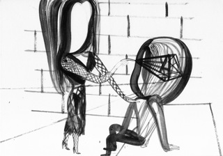
AS: I love the details, the tiny feet and cuffs and collars but you’ve left the faces blank so you don’t get involved in the detail of that.
ET: If they had faces then they might be expressive in an illustrative way and also, this telling of things, they’re in my mind or they’re memories or whatever, but they’re not unique. It’s not like this only happens to me. It happens to everybody all of the time. I like the idea that you might see something acted out by someone in a film and then you might see another version with a different actor but it’s the same role; it’s like that.

AS: You really allow yourself to do anything in these don’t you? Some of them are quite rude.
ET: Yes, I include really personal things all the time. But I should say that those two are not to do with my personal life. One is based on a Moravia novel and the other is called ‘Shades of Black, Everything Bad, Everything Wrong’. It’s a catalogue of things on TV screens that I haven’t experienced first hand; things I only know from TV or film so there’s film noir, where a woman murders a man; people are gambling for high stakes; two lovers are in a motel room, she leaves him and he kills himself; a biker gang kidnap a rocker and a woman buying guns. I suppose the thing that you could say about all of them is that they are about things I think about, so it doesn’t matter if I’m considering something that I’ve seen or if I’m thinking about what I did last night. They all come through this space, which is my mind. They could be anything. I don’t think ‘oh I’d be ashamed to put that in’. It’s exactly like writing a diary and you write whatever you want.
Emma Talbot is currently exhibiting 'Pictures From My Heart' at Transition Gallery, E8 until 16 May 2010, gallery open Fri-Sun, 12-6 pm.
Her new Tranzine 'Between the Shadow and the Soul' is available here for £3, limited edition of 100.
Images courtesy the artist and Transition Gallery.
This comment has been removed by a blog administrator.
ReplyDeleteThis comment has been removed by a blog administrator.
ReplyDeleteGREAT, GREAT!
ReplyDeleteGreat information. As a person starting out, I find this information very useful, glad I stumbled upon your site.
ReplyDeletePainter and Decorator Walthamstow